Color is super powerful. It has the ability to evoke feelings in us we didn’t even know we had. Anger. Fear. Passion. Envy. Love. Color is also subjective. What you may see as blue, I may see more as teal. Color has been discussed and analyzed since prehistoric painters mixed the first earth pigments from charcoal, bones and a host of other readily available minerals. Fortunately we’ve come a long way since then. I can literally “paint” your next logo design with the click of a mouse in everything from sage green to chartreuse. Color theory has evolved too.
Today designers use color theory to develop unique color palettes for their clients everyday. Like choosing warm colors over cooler ones, or devising a set of tints and shades for use across print and the web. Such exercises help designers create perfect palettes designed to sell brands, make logo designs stand out and even improve user experience.
Color has intention. It should be used wisely, but that is easier said than done; even for a designer. The trick is keep it simple.

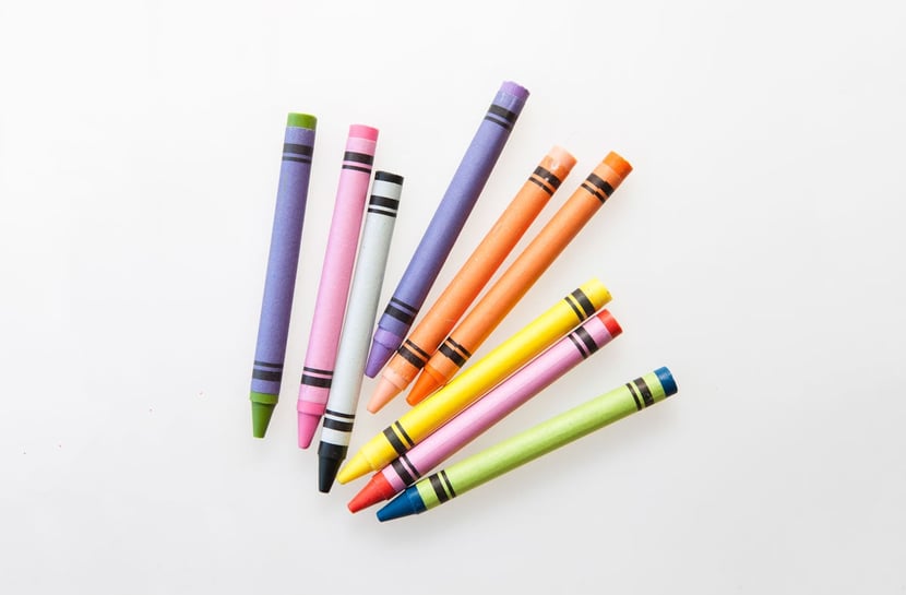
When I first tackle color for a logo I’m working on, I like to reference the following metaphor: picking paint samples at your local hardware store can be overwhelming. Stay home and pick from the crayon box instead. Starting with what speaks to you will give you good footing to launch into a full-blown color exploration.
If you’re thinking about colors all by your lonesome, there are a few more tips you can use to create a palette that expresses your brand’s attributes and values:
Start With the Familiar
You probably have a favorite color. Is it blue? Maybe it’s purple. Really, it’s that simple.
Chances are, before you secured a business license or started scribbling down logo ideas, you had a color in mind that you like. Coca-Cola chose their famous brilliant red hue very much the same way. Frank Robinson, who first drew the now ubiquitous Coca-Cola logo, simply liked the contrast of red on white. That was it. Now the color is trademarked and protected. If you’re favorite color is Coke Red, pick another crayon.
Research
At the end of this exercise, you’re going to have a color or colors that represent your brand, and you can’t exactly go changing it later. Not without losing equity anyway. That’s why research is so important.
Start with what you know. What are your brand’s values? What words do you want consumers to associate with your brand? If you have an editorial style guide or similar document detailing your brand’s voice, this would be a good time to get that out and reference it. Another great place for research is Pinterest and even Instagram. Scouring these digital moodboards can unearth color combinations you might not have previously considered. What’s trending? You’ll start to notice patterns fairly quickly.
Lastly, look at your competition. What colors are brands in your industry already using? Yellow and gray? Maybe green and blue? Take note and see if you can build off of what’s already been done. Of course you want a unique look for your business, but the colors you choose have to also feel right for the segment you’re going after.
Tools for More Inspiration
I mentioned Pinterest and Instagram above as sources of visual inspiration. While they may rock at providing a creative spark, nothing can replace getting your hands dirty (metaphorically anyway). As a designer, I use tools every day to help me ship projects and impress clients. Many of these tools are available to the public, including ones that will let you test drive a few colors before committing to colors for your brand.

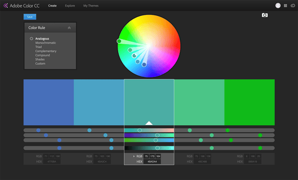
Adobe Color
As a web based application, this tool is fairly accessible and highly interactive. You can toggle color rules (monochrome, complementary) and toy with individual sliders to create a palette of up to five colors.
Colour Lovers
Essentially a social network for people overly excited by color, here you can create, share, and compare color palettes created by the community. Go straight to the Palettes page to sort through more than 4 million custom color combinations.

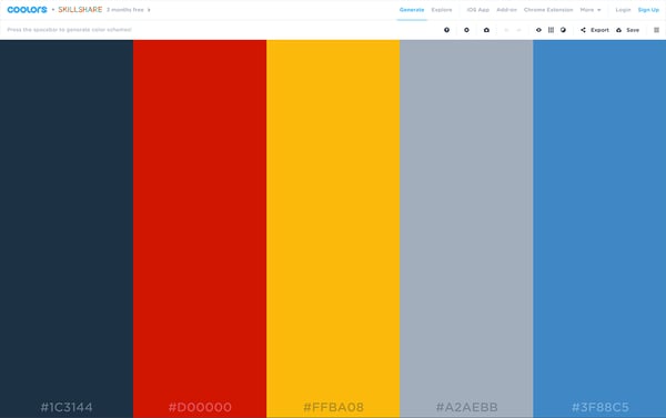
Coolors
Coolors is similar in function to Adobe Color above, but features a simpler interface as well as an iOS app. Slide color blocks around, lock them in place and change the hues. The functionality is quite nice and the site touts itself as a “super fast color scheme generator.”
Colormind
Colormind is similar to the tools above, but can randomly generate palettes with the click of a mouse. These can be good for instant inspiration. What’s even more exciting, however, is the ability to generate a color palette from a photograph. Upload a picture and Colormind does the heavy lifting for you.
Use the 60-30-10 Principle
Across disciplines, designers have often used the 60-30-10 principle when working with color. It’s not a trade secret and fairly easy to follow (if you already have colors in mind.)

Simply put, the rule suggests you use:
- 60% of your primary color,
- 30% of your secondary color, and
- 10% of an accent color.
Using these proportions helps create an overall unified design theme, while providing just the right amount of contrast and visual appeal. A simple brand palette looks professional and focused, and when executed with balance and proportion, leaves a lasting impression.
Capitalize on Common Associations
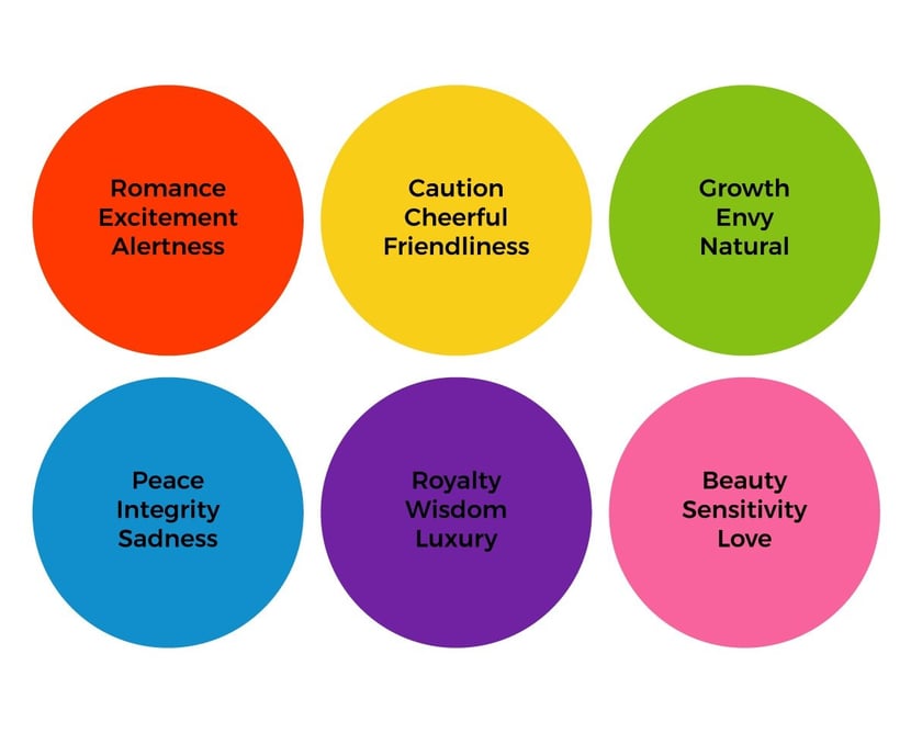
Many colors have widely accepted meanings, symbolism and significance. When all else fails, the 60-30-10 rule, trusting your gut and looking at the common associations for the color blue for instance can help expedite the process of choosing color. Many businesses in the technology sector use blue for it’s cool crisp feel. Similarly, natural food companies utilize greens and browns to suggest the earth from which their products originate.

What product are you trying to market? What goods or services do you offer? The very nature of why you started a business in the first place may be all you need to develop and appropriate color palette for your brand.
There are a number of techniques you can use to discover the perfect color palette to represent your brand. From free color palette generators on the internet to going with what feels familiar, finding color doesn’t have to be daunting.
Experiment. Have fun. Make the process as painless as possible. And keep in mind, you needn’t go further than a crayon box to get started.
 Remington Begg
