 Remington Begg
What Makes a Logo “Good?”
Some logo designers would argue the exploration of color theory makes a good logo, while some would opine that strict adherence to the grid is the only way to go. Still, others will suggest it’s the typeface the designer used. (Unpopular opinion alert: you’d be surprised how effective fonts Papyrus, Zapfino, and Comic Sans can be when used appropriately).
Despite all these ways to judge the success of a logo, I believe what makes a logo good is adaptability.
If you’re designing a logo or asking somebody to do it for you, the one thing you’ll want to plan for is where you’re going to use your logo.
You don’t want your brand’s full-color logo printed on highly porous and costly newsprint. Likewise, you wouldn’t wear jeans to a funeral.
That being said...
Everybody Likes Options
If you only own jeans, then invitations to funerals probably aren’t in your future. However, if you’re like most humans, you have a wardrobe that includes pieces for dressing up or down depending on the occasion.
Treat your brand’s visual identity the same. A color palette, rules for photography, patterns, and textures all play a role in how your brand catches the consumer’s eye. Your logo design needs to come with options.
A Good Logo Comes in Various Sizes
Say your brand’s primary logo is rectangular in nature. This is a completely fine choice. Rectangles are great shapes! But what happens when the space your logo is going to be used in is more of a square? You’re out of luck if you or your designer didn’t plan ahead.
Here are four variations of your logo you need as it relates to size:
Primary - Vertical or Horizontal
Your primary logo is a version that is stacked in a vertical or horizontal position, perhaps with an icon on top of or to the right or left of the main piece of text.
 Alternate - The Other Direction
If your primary logo is vertical, the alternate would be horizontal or vice versa. See the notes above for how this lays out.
 Icon Only
A well-designed icon can be a powerful stand-in for your full logo especially when space is limited. Think business cards, website footers, or smartphone apps. The trick is to remove as much as possible while maintaining the brand’s essence.
 Wordmark
Similar to the icon-only version, a wordmark is the other half of your primary logo: text only. Text only can be a good version to have on hand when the full logo is too much, but the icon risks not saying enough.
A Good Logo Comes in Different Colors
Chances are the colors of your new logo design were debated at length, either between you and the designer or internally with all of your organization’s stakeholders.
Color is powerful. It can influence the products we buy on a very emotional level. Researchers at Berkeley have concluded an individual’s attraction to certain aesthetics remains mysterious due to the complex and objective nature of color.
Unfortunately, there is no right answer. While the success of your logo design is often determined by its color, listening to gut instincts can be a safe bet. Go with what you like, but, similar with size and shape, have options on hand.
 Primary
This version of your logo is your full-color masterpiece. It may include a gradient, multiple colors, or even varying tones of the same color. It’s going to best be used on screen and in high-quality print environments.
 One Color
While the multi-color primary version of your logo should be your brand’s workhorse, there will be the occasion when the color needs to be reduced. A one-color alternate is great for scenarios like lower quality print runs, on top of complicated backgrounds or to provide a more focused aesthetic in seasonal marketing campaigns.
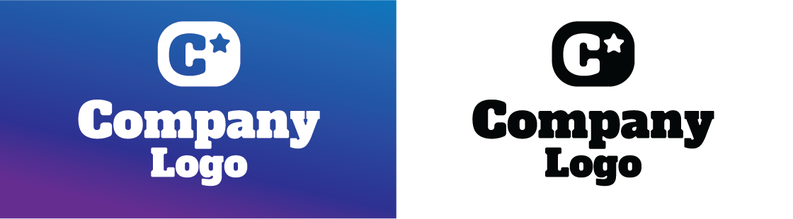
Knockout
Sometimes no color can pack just as much of a punch as full color. Having reversed, or “knocked out,” versions of your logo rendered in all black or white works well to create contrast while still providing brand recognition.
 Grayscale
Grayscale, or varying degrees of black, was the go-to logo version for printing. Because of the porous nature of newsprint, a grayscale version of your logo could retain the nuances of the full-color variation while requiring the least amount of ink. While used less and less today, it’s still good practice to make sure your design team provides you with this version.
Planning Ahead
If you take into account all the versions of logos listed here, it’s easy to see how one logo can quickly turn into 16. By mixing variations of color and size, you end up with a library of logos you can use across the marketing landscape.
When you set out to have a new logo design developed, it’s good to think ahead about all the places you’ll want your brand represented. Logo adaptability is just one of five important things to consider when designing a logo.
Having options in your toolbox for deploying your logo across print and digital media alike provides your brand with two things: consistency and familiarity.
A logo is consistent when it can be scaled large or small and produced in color or grayscale. A logo design is familiar when passersby on the street recognize and remember it without hesitation. Both familiarity and consistency help establish brand equity.
