Google provides a wonderful experience for their users. Just before I began writing this blog article, I googled “user experience.” Just like that, my answer lay before me in a cute little package at the top of my search results. (Well, after a few ads anyway! 🤬)
How great is that?! I didn’t have to put in much work to find the content I was looking for. My journey was straightforward and uninhibited. Zero friction, if you don’t count the ads! That is what user experience is. A frictionless, straightforward set of steps to get from point A (my question) to point B (my answer.)
Sometimes you will see user experience abbreviated as UX, and with the proliferation of this unique area of design over the last half decade, chances are, you’ve come across the term once before.
Why You Should Care About User Experience
If we pause for a moment to think of another way to say “user,” what comes to mind? You may have come up with “human” and you wouldn’t be wrong. The field of user experience is essentially a more marketing friendly version of the phrase “human computer interaction” or HCI. As a matter of fact, UX has roots in HCI and the two fields overlap.
But let’s get back to the word “user” or “human,” or wherever we trailed off. The other word I was hoping would come to mind during our moment of silence together was “customer.”
Good user experience is good customer experience.
Whether your organization is B2B or B2C, a good user experience should be high on the priority list. Better UX could mean longer time spent on your site or your app, which in turn could lead to higher conversion rates. Conversion rates tracked over time are actually the best way to measure if your UX research and design is working.
But, conversion rates aren’t the whole story!
What? GTFO! Yes they are! Visitors need to fill out my form and pay me!
Calm down, Frank. They’re not. Let me explain.
Decision is just one part of the buyer’s journey and comes only after the customer has both become aware of a problem and begun considering solutions. Regardless of where a prospect is at in their journey (or your sales funnel for that matter) user experience has a role to play the whole way through.
When the users are prevented from moving between awareness and decision, or from visitor to customer, something needs to change, quick! In the case of your website, removing these points of friction equates to good user experience.
Companies Making Good User Experience Their Business
I mentioned Google earlier, as an example of good user experience. One could argue user experience is their entire business model. It has to be, they’re a search engine: completing user tasks is why they exist. But there are a whole host of other companies on the internet that can be looked to as good examples of user experience improving the buyer’s journey.
Warby Parker’s Eyeglass Quiz
Warby Parker is in the business of providing designer eyewear at a fraction of the price their competition does. To execute their mission, a majority of the business they do is via their website. Digital companies have less overhead than their brick and mortar counterparts, which tends to lead to reduced prices for customers. But selling products on the internet is hard. It can take a lot to convince a visitor to become a customer.
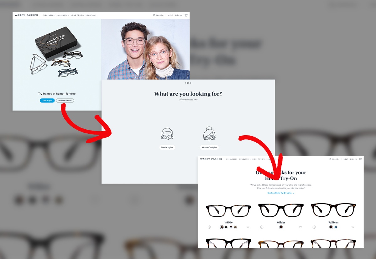
That’s where Warby Parker’s eyeglass quiz comes in. Accessible right from the homepage, WP clearly caters to folks in the awareness and consideration stages of the buyer’s journey. The quiz expedites the process of walking skeptic shoppers through to a results page where they can browse frames catered to their needs. Each question in the quiz is displayed on it’s own screen, free from other distracting links or calls-to-action. The process is frictionless, and empowers the user by making them feel completely in control of the decision making process.
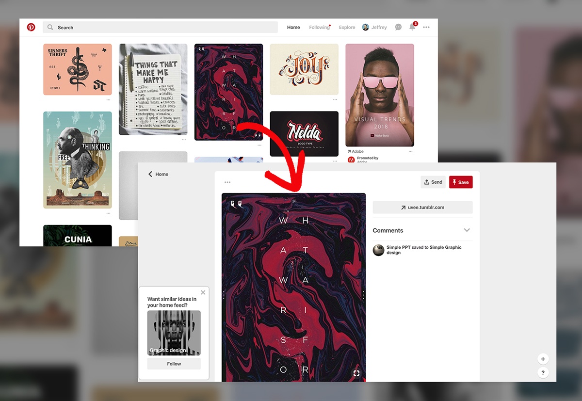
Pinterest Has Made Their User Experience Addictive
Now this one may be an obvious choice for good user experience, because Pinterest lives and dies on the internet and making things easy to discover and share is THEIR ENTIRE business model. The interface is uncluttered (if you don’t count the endless stream of images) and the user has only one thing to do: discover and “re-pin” things to their own boards. When a user clicks into a pin for more information Pinterest delivers similar content almost immediately.
Just take it from Jenn, one of our content mavens:
“I know it’s kind a huge site but Pinterest. I just discovered they have a feature that when you zoom up on a photo, it’ll try to find other related photos of that item and it’s blowing my mind.”
Why is this a successful user experience? Users of the website return over and over again. It’s like an addiction. Because of this, Pinterest has attracted big brands to the site to run ads that slide right in seamlessly alongside native content. It can feel a bit deceptive, but each “promoted” pin does have text underneath saying as much. In the case of Pinterest, a great user experience has translated into advertising dollars for the social media powerhouse
Babbel Thinks Signing Up is a Hassle in Any Language
As the world’s first language learning application, Babbel’s mission is to get individuals learning and using a new language right away. And that’s exactly what Babbel delivers. Immediately upon landing on the homepage, Babbel drops visitors right into their first language course. Instead of encumbering users with a sign up form, or information about pricing, the visitor can select the language they want to learn from a drop down and they’re off.
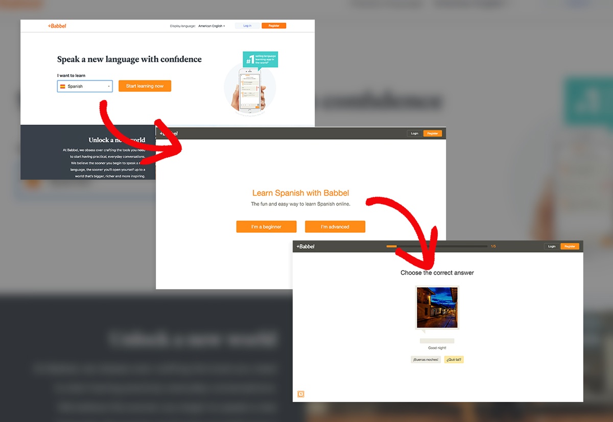
It isn’t until after the user has completed the first lesson does Babbel begin to ask for further clarification from the user. At this point, questions like “What’s your first name?” and “How did you feel about the first lesson?” keep the tone conversational and friendly. The user experience builds to something great, with the user in control the whole time. There is almost no friction, as questions are asked one by one, preventing any feeling of being overwhelmed or confused. The task of learning a new language is daunting enough. Knowing this, Babbel’s great user experience removes a lot of the roadblocks, beginning with the user experience.
It’s Simply About Removing Friction From the Experience
The number one reason people will leave your website is because they can’t find what they’re looking for in under a minute. Yes, that’s all they have time for, especially with all the other tasks they’re trying to accomplish on the internet.
I previously wrote about the ways in which you can drastically improve the user experience on your website. I even shot a video on the subject where I smash a computer and get hit in the face with a football. Some things you can probably implement tomorrow to improve your website’s UX include:
- Reducing the amount of clicks to find something
- Using varying headline sizes and line space in your body copy
- Giving your call to action buttons more contrast
- Removing vague language from navigation items
Most of the issues above arise from bad planning, or neglecting user experience in the first place. If you want your organization to turn more visitors into customers, you have to think seriously about how your website works as a resource for people in every stage of the buyer’s journey.
From reading blog articles to requesting free downloads, or from filling up a shopping cart to submitting payment information, user experience is everywhere on your website. Regardless of which KPIs your business chooses to focus on, they can each be affected by good user experience.
Good user experience is good business.


.png?width=600&name=Webinar%20Thumbnail%20(3).png)
