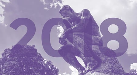
Last week, Pantone, the folks who set color standards for the earth, announced 2018’s color of the year: Ultra Violet.
It’s a basically shade of purple, but that didn’t stop the Pantone team from writing 1600 words explaining as much. Ultra violet is meant to convey “originality, ingenuity, and visionary thinking,” traits that should sound familiar to entrepreneurs and business owners alike. Perhaps 2018 will be the year your business makes a big move into a new segment, or goes from startup to scale-up. In either case, color and moreso design, may very well be at the center of your prescription for growth.
Whether you decide to use Ultra Violet is up to you, of course, but as with every design decision, you’ll want to watch out for trends like this in order to stay ahead of the curve. Below are some of the trends we see on the horizon for 2018. However, predictions can be false and blogs are never a perfect substitute for professional advice. Always seek the advice of a designer or other qualified marketing pro with your business branding and design questions. (Seriously, reach out if you need help!)
Serif Fonts Are Back
Chances are, Times New Roman was the default font on an old PC you had. You’d fire up Microsoft Word and begin a new document without even thinking twice. Times was there for you. Times is what’s known as a serif font. Serif fonts are characterized by the little extra bits that extend away from the ends of strokes.
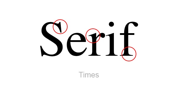
There have been scientific studies on the readability of serifs, and with technology brands dominating the headlines, there’s even been a shift away from using serif typefaces altogether. (Sans Serif fonts, by contrast, offer the cleaner lines associated with corporate entities and Silicon Valley startups.)
Except now, the pendulum is swinging back in the other direction. On the web and on store shelves where brands are competing for space, a move toward serifs is already underway. When used in a contemporary format, serif fonts have the power to communicate both ingenuity and trustworthiness. In fact, best-selling yogurt brand Chobani recently underwent a rebrand, incorporating a warmer palette of colors and a custom, chunky serif font that just feels right for the brand.

If you need some serif inspiration before you begin seeing it everywhere in 2018, check out some of the best from 2017.
Has the “Flat Gradient” Reached Its Peak?
Open up any app on your smartphone, or navigate to a landing page on most websites, and you’re bound to see it: the “flat gradient.” Although the term is a bit of an oxymoron, the past couple of years of web design have been flush with this design element that’s essentially a mix of a high fidelity gradient and flat color palette. Give the old Google a whirl for the term “flat gradient” and you’ll see what I mean. My image results are below:

This design trend began to surface around 2014 and has had a good run. I suspect designers started using flat gradients out of a mix of necessity and experimentation. Not every brand can afford full scale photo shoots, especially ones in startup mode. Gradients filled that void. And they’ve worked. Color can instantly transport the viewer from one mood to the next, especially when connected to a brand.
The flat gradient trend surged in 2017, so it might have some steam heading into 2018, but it’s also time to start rethinking what can be used in its place. Illustration and video (more on this below) get my vote, as they can be easily customized to compliment your brand, without being easily copied.
If Gradients Are Out, Is Video In?
Despite being a relatively inexpensive solution to a gap in your design language, the gradient has oversaturated marketing on and off the web. Maybe 2018 means pursuing a little more originality, even if it’ll cost ya!
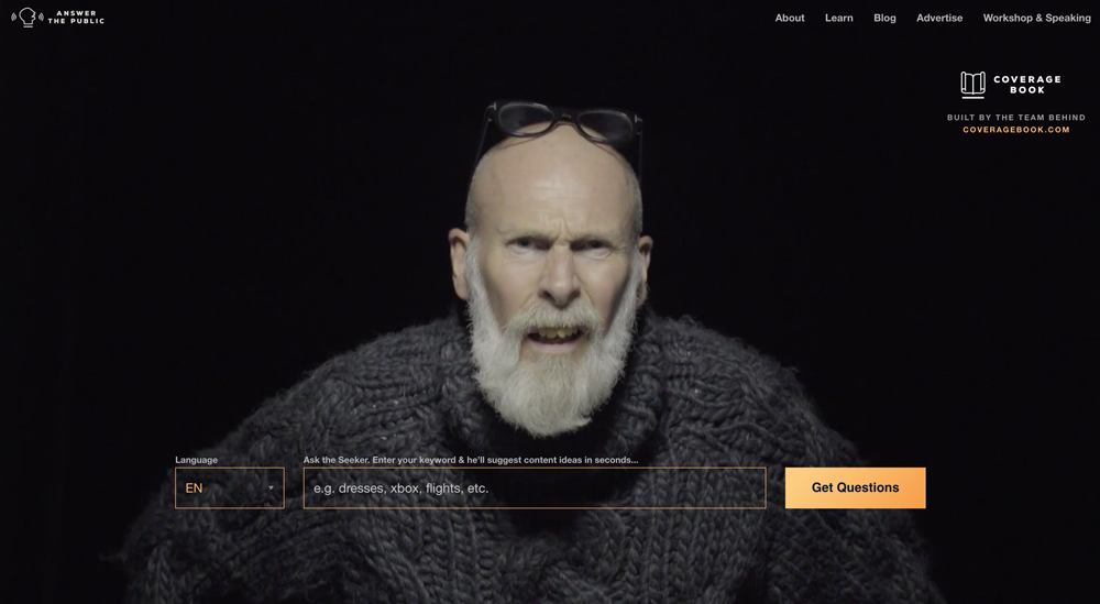
From live video on social media to scripted video on your website, moving images are becoming more and more central to brand marketing efforts. On your website, video can be used as background elements or to better explain a product or offer. Using video “above the fold”, in the header section of your website, can create an awesome first impression for your brand. One website we use at Impulse Creative for our blog research uses video on their homepage in a very clever way:
By 2019, 80% of web traffic will be headed toward videos, so you may already be way behind on this trend. But there’s still time, and working with an agency focused on video may be just what you need. Check out my Impulse teammate Danielle’s extensively massive guide to video marketing. It covers everything from setting up a shot to promoting video on social and beyond.
Handmade & Authentic
Video helps to tell a story in a way a photographs can’t, offering a more authentic picture of you and your brand. But in the absence of screens (or budget) how can a business convey a sense of realness in their marketing? Pick up a pencil!
Hand drawn elements such as illustrations or typography will continue to flourish in 2018. Rough edges and noticeable sketch marks can lend a brand instant authenticity and integrity. Though the resurgence of hand lettering in advertising dates back almost as far as the flat gradient, unlike the gradient, hand lettering can be easily altered to fit a message or a brand. This highly-customizable design element may not be right for all of your 2018 marketing however, so proceed with caution.
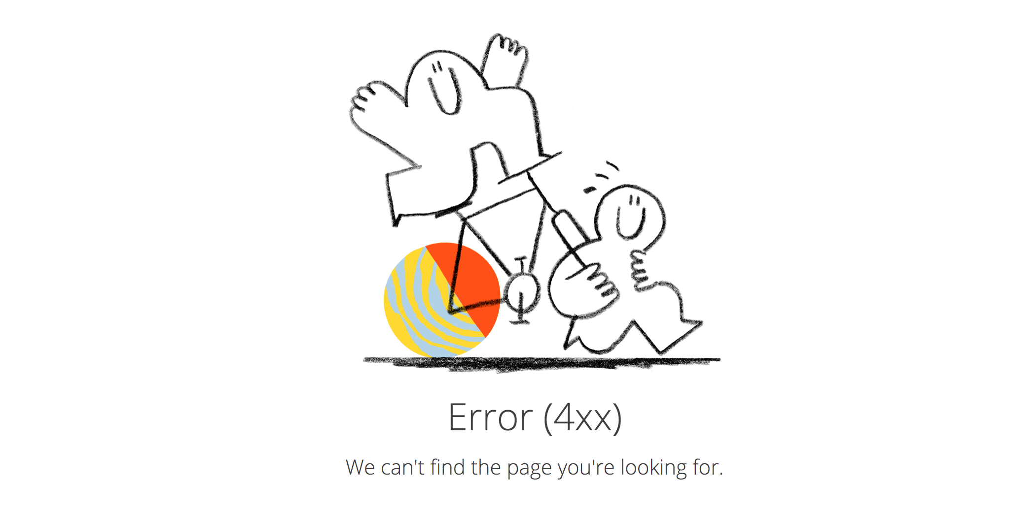
Recently, Dropbox introduced a completely new visual language for its family of productivity and storage applications. As part of their rebrand, they’ve begun using illustration in fun and curious ways, including app walkthroughs and 404 error pages. Watch for more brands to develop illustration styles in 2018 as part of their marketing and branding efforts.
Trending Not Trendy
With any design trend, the key is subtlety. You don’t want to go all in on one design element, only to have the zeitgeist change overnight. If you can scope out what's trending, before it becomes trendy, you’ll be able to better differentiate yourself from your competition.
Whether you experiment with gradients and video on your website, or hand-lettering and serif typography in your collateral, do so with an open mind. Being open to new things on behalf of your brand allows you to be more flexible and deliver an authentic customer experience. If Ultra Violet has anything to say about it, 2018 will be the year your brand aims to be original, ingenious, and visionary.

.png?width=600&name=Webinar%20Thumbnail%20(3).png)
