2018 has marked some serious changes in the search game— and website owners everywhere are seeing some pretty rapid influxes in traffic and rankings.
The changes began in March, when Google pushed out testing for its “mobile-first indexing.” Then in July, when the search engine rolled out its PageSpeed algorithm update, things really started heating up.
Now… it’s here. Ladies and gents—the moment you’ve all been waiting for: the mobile revolution.
Search results are changing, with your mobile site becoming the primary crawled and indexed face of your website, no longer your desktop version. Although this “mobile-first” strategy isn’t exactly fresh news, Google’s index update includes major changes to the way the search engine ranks your content.
The mobile-first indexing update signifies a huge shift away from desktop-structured sites and makes mobile-mindfulness an absolute necessity of your digital strategy.
In order to protect their position within Google’s search result rankings, many businesses will need to make SEO adjustments, to improve website user experiences and to reassess their overall web strategy, immediately. The start of mobile domination has begun— and you better be ready.
What is Google’s Mobile-First Indexing Algorithm Update?
Google announced in March that it’s migrating certain websites to a new form of indexing, which it calls “mobile-first indexing.” The search engines has since began to roll out and deploy this updated index to a wave of participants— sites who are offering a mobile experience by following Google’s best practices for mobile-indexing.
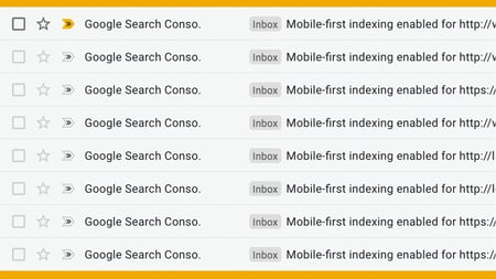
Many of our readers and clients have received this email from Google’s Search Console:
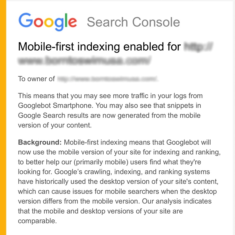
For those who’ve received this message (since Google started this little experiment in March 2018), check your Search Console. You may see an increase in traffic from the Smartphone Googlebot, or you may notice that the cached versions of your pages are likely mobile-based, not desktop, as the search engine begins serving your mobile site for more queries.
As Google states in the link above, they’re evaluating each individual URL’s “readiness for mobile-first indexing” and “slowly” transitioning certain websites to this form of crawling, indexing and ranking change.
This is HUGE, as, historically, the desktop version of your page’s content was what Google trusted and served first on the search engine results pages (SERPs). This transition means that the Googlebot will now look at and serve the mobile version of sites first, before the desktop version.
Now, this doesn’t mean your desktop version isn’t important. In fact, the algorithm update is called mobile-first indexing after all, not mobile-only, as Moz points out. Meaning, if you have a mobile site, it’ll likely choose to serve that to mobile searchers. If you don’t have a mobile site, you can still rank for your desktop version, but the odds are being gradually stacked against you amongst a sea of user-friendly and mobile-savvy competitors.
All these changes are centralized around one core idea: a future where mobile-friendly sites are the only ones suggested in mobile search queries.
How Could Mobile-First Indexing Affect My Website & Rankings?

Google’s mobile-first index update means that website owners have a new baseline for how the world’s largest search engine determines rankings. The mobile version of your site will now be considered the “primary version” of your website.
This demonstrates a huge change in the way the search engine is viewing content, as well as a forceful effort to put the user experience (UX) first and adapt to user behavior trends.
What does this mean for businesses without mobile-friendly site functionality? Although your content will still be indexed, your website’s rank may fall as your competitor’s mobile-friendly websites climb.
Simply put, mobile-friendly sites are beginning to outrank desktop versions on mobile— and are expected to take over the SERPs in the future, motivating website owner’s everywhere to reevaluate their digital marketing strategies. In order to compete on page one of Google, you need to shift your focus to your mobile compatibility and experience— now.
Analyzing Your Website’s “Readiness” for Mobile-First Indexing
In order to compete on the SERPs, your mobile site needs to meet or exceed Google’s standards. Is it mobile index-friendly? Friendlier than your competitors? Let’s see.
There are a few different types of mobile sites:
- Responsive // Your desktop and mobile versions are identical, with the mobile version often having a collapsible menu to keep content digestible.
- Adaptive (sometimes called dynamic serving) // Instead of responding to the size of the browser with content that smoothly expands to fill the screen, adaptive sites have content that’s confined to a few different sizes, using the one that best fits width of the browser. Basically, your site serves different content based on the searcher’s device of choice.

*In this above animation from CSS-Tricks, you can see how responsive (on top) sites differ in the way they adjust content from adaptive (on bottom) sites.
- Separate mobile site // This is a completely separate URL than your desktop site, often including less content than that version, customized for mobile users only. You must make changes to both sites separately, as they are two different entities.
- Other sites // There’s also accelerated mobile page (AMP) versions of your site, or HTML with only specific JavaScript components available. The script tells search engines to only load certain elements of a page for mobile users, making it easier, and often faster, for bots to preload and serve the site.
For those with responsive or adaptive websites, your content on your mobile version and desktop version probably matches pretty closely. Google always crawled both versions of your site, even content hidden behind a “hamburger” mobile menu, serving your mobile version on mobile queries and the desktop version on desktop queries. Pretty straightforward.
Those with separate mobile sites or pages, however, often create a different URL to shave content for improved navigation and user experience on smaller screens. In light of Google’s mobile-first index update, these website owners may find that the slimmed version of their site could be served more frequently on the SERPs. That means, if you removed content for mobile users, Google might be seeing that as your primary site, which could affect your rankings in this mobile-first revolution.
Many SEOs prefer to maintain responsive sites to encourage ease of rankings— and Google itself recommends using this type of design— but regardless of the type of mobile website you have, it’s the one being indexed now, and should be the target of your optimization efforts.
How Can I Optimize My Mobile Site?

In order to ensure your traffic and conversions aren’t negatively impacted by Google’s mobile search ranking changes, you must prioritize improving your mobile experience. Here’s a few ways to create a more mobile-friendly website:
- Verify your site in Search Console. // If you haven’t already, verify your mobile domain with Google’s Search Console, to alert the search engine to crawl not only your desktop, but also your mobile version.
- Consider how people are consuming your content. // Many website owners were previously focusing their SEO, UX and user interface (UI) efforts on their desktop site— with mobile all too easily becoming an afterthought. Google’s update means you must make sure your mobile version is equally functional and optimized, if not better, as the search engine cuts back on indexing desktop sites. Your mobile version is your new “primary” default, so you really need to win with this version.
TAKE ACTION: As this transition happens, more people will be using your mobile version to fill out out forms, make calls, etc. Does your mobile interface allow for a seamless conversion funnel? Read this article to make sure.
- Track and make adjustments. // With this mobile-first indexing shift, you will see varying ranking results between mobile search results and desktop search results. Track both and see how users are consuming your content. Consider a heat map tracking tool to see where users are falling off, especially on your mobile devices. For example, if a video won’t load on mobile or a button isn’t clickable, prioritize mobile testing across the troublesome pages.
- Improve the hell out of your page speed! // Google’s page speed algorithm update rolled out in July, announcing that page speed is now a ranking factor for mobile searches. Although Google won’t give us a specific metric about what’s considered a “quick load speed,” to compete in today’s big ocean, your fish has to swim faster. Use their Developers PageSpeed tool for feedback on how you could improve your load time.
TAKE ACTION: If your site is reasonably fast, tweaking won’t change much, so shift gears to these other best practices for mobile-first indexing.
- If you don’t have a mobile version, GET ONE— but do it right. // Google will continue to show the URL that is the most appropriate to users in search results, so for those without a mobile version, your desktop version will still get served. However, desktop sites are slowly being phased out on the SERPs and being replaced by mobile-friendly ones.
TAKE ACTION: With such high stakes, it’s better to wait to release a polished mobile version with improved UX/UI than to push out a broken or incomplete one. Don’t publish a placeholder. Instead, make it great and implement educated improvements along the way. Here’s some tips for getting lofty projects done, like a rockstar.
- If you have an adaptive (dynamic serving) or separate mobile URL, these changes affect you the most, so get crackin’. // Make sure you’re following Google’s best practices for mobile-first indexing, such as keeping your content equivalent in optimization and value, making sure you have the correct rel=canonical and rel=alternate link elements between your mobile and desktop versions and more.
Should I Be Panicking if My Mobile Site Sucks?
Don’t have a breakdown or anything, but your mobile website needs to take priority more than ever. So, kind of.
In July 2017, Google said it’ll probably take a few years before the SERPs become a mobile-only playground. The search engine is cautiously rolling this index out, and doesn’t have a timeline for when it’ll be fully implemented. Nonetheless, it’s already affecting us and you need to make your mobile site your first concern, as the very foundation for your marketing success.
Keep Ranking Strong!
With mobile commanding center stage, SEO matters more than ever.
Stand behind Google’s unrelenting effort to reflect the user behavior trends by optimizing your site for searchers and search engines alike.
We have the secret ingredients to ranking on page one. Download our SEO Casserole Cookbook to whip up a mobile website so irresistible, Google won’t be able to help but serve you as the main course on the SERPs.
Don't feel like doing it all yourself? Check out our SEO Services page and let one of our inbound experts get you rankin'.


.png?width=600&name=Webinar%20Thumbnail%20(3).png)
