If you haven’t checked out Google.com in the past day or so, take a moment to head over to the site and give a few good looks at what’s on your screen. Once you see it, you’ll know just what I’m talking about. Don’t be fooled, this is still the same search engine that we’ve come to know and love, just with a bit of a facelift.
![]()
After more than a decade of using the same visual identity (with very minor tweaks along the way) Google unveiled its new logotypes and doodle yesterday to the masses, as it reshuffles its corporate structure. The topic has become quite the divisive topic among the online community in a short time since its reveal. Some are praising the new design as a breath of fresh air, while others are criticizing that it is unimaginative and uninspired. All opinions aside, it is nevertheless a perfect example of the minimalistic design trends that are rising in popularity today. In a nutshell, minimalism is the school of thought that rids a design of any distracting and unnecessary elements, and pares it down to its most basic form.
Looking at the Design
Right away, one can tell that the overall design aesthetic is much simpler than the previous logo (which was already pretty simple to begin with). There are essentially two elements at play here: the typeface and color palette. The new logo abandons the familiar serif typeface, which has the small lines extending from the ends of the letter strokes, which has become quite dated over the years. A custom sans-serif font is used instead, appearing to be more streamlined and light-hearted. While blue, red, yellow and green remain as the brand colors, they have been updated as well, becoming brighter and more vibrant than what we’ve seen before.
The Bigger Picture
The one reason for the design update stems from the company’s increasing ability to engage through multiple platforms; on our smartphones, tablets, desktop computers, and even our cars. These devices each have their own dimensions and differing screen sizes, and Google needs to be able to adapt to every one of them. Their new logo, having a much cleaner and simpler appearance, can easily scale down to smaller screens and still be crisp and recognizable. This logic translates throughout the rest of their applications as well: Search, Google +, Mail, Calendar, etc. Through unique animation sequences, the main icon can transform into each of the sub-logos and back again. It is a nice touch that guides user experience, enforces brand unity and stability, and is definitely cool to watch in action.
Ever-changing, Ever-evolving
What Google has demonstrate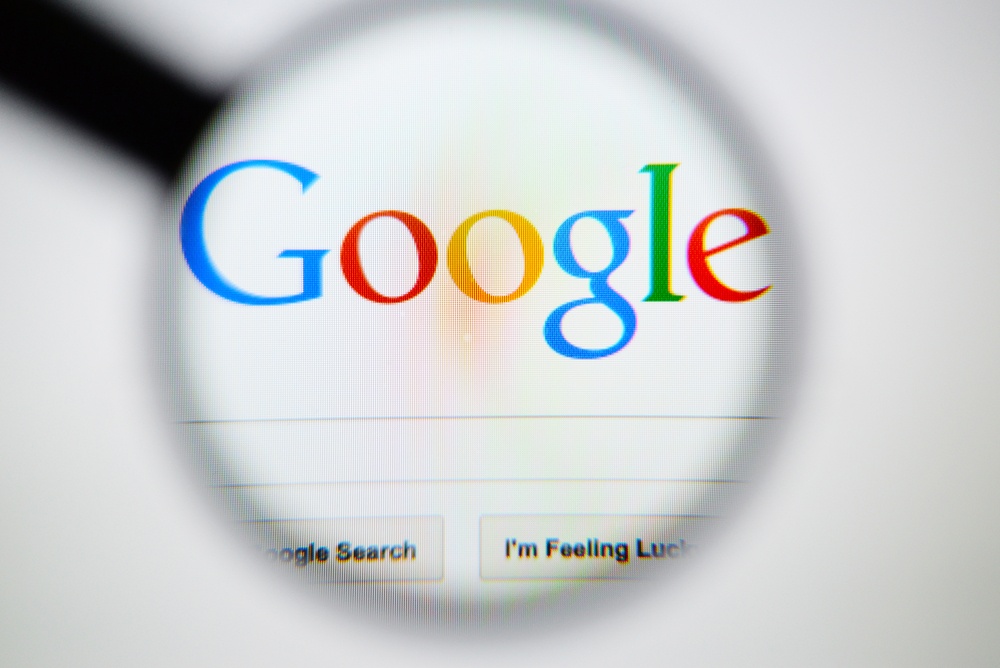 d is that flexibility and adaptability are essential in the ever-changing, ever-evolving realm of technology that we are experiencing today. These are good qualities for an organization to possess. In order to stay relevant and not get swallowed whole by the next round of device updates, organizations need to ensure that they are effectively reaching their target audience through all available channels such as print, desktop, mobile, and so on. This could merely mean updating a corporate logo into something that is identifiable and can scale down to smaller dimensions like Google has done, embarking on a full website redesign that is optimized for mobile, and focuses on an enhanced user experience.
Whether you love it or can’t stand it, the new Google logo is here to stay. It is a symbol of our time, a time of transition and evolution. It is a reminder that it is imperative to adapt your branding and marketing efforts to relay across all platforms, so that you are addressing a greater audience. With a crisp design, smooth user experience and remarkable content, you are sure to attract an abundance of new leads and customers.
Interested in a refreshing new look for your company? Get a free assessment or download our Logo Grader.


